CLIENT: KOMAZA
STUDIO: CLARKE
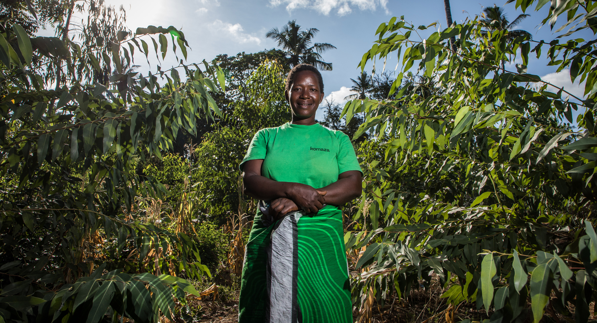
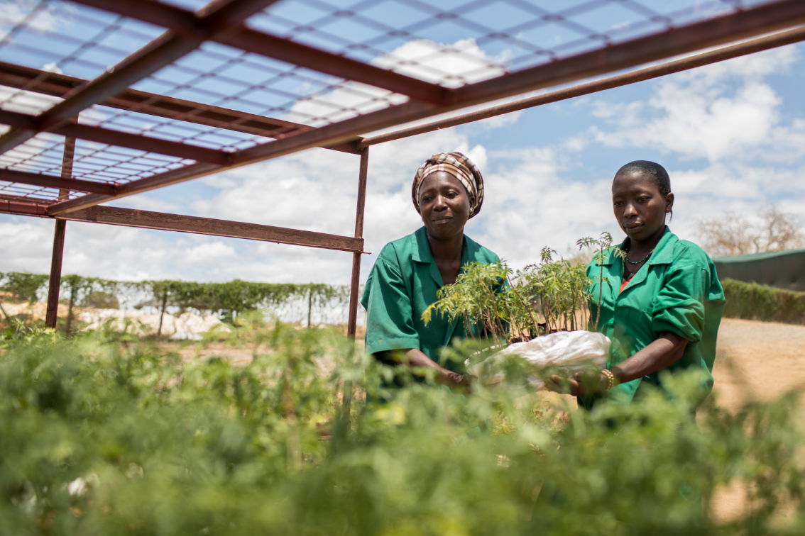
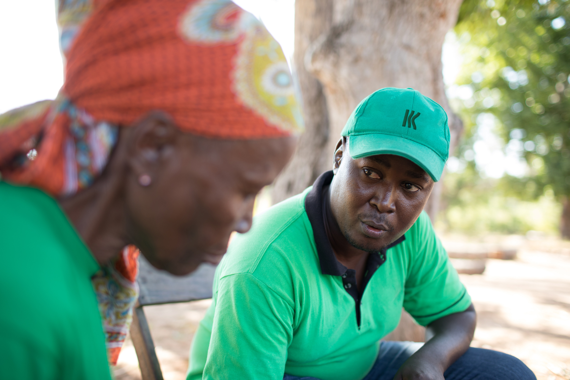
Komaza is a tech-enabled, sustainable forestry company based in Kenya. Its innovative microforestry model works with local smallholder farmers to yield trees to meet Africa's growing demand for wood supply. This brings not only income for the farmers, but restores degraded lands, prevents biodiversity loss, and mitigates climate change.
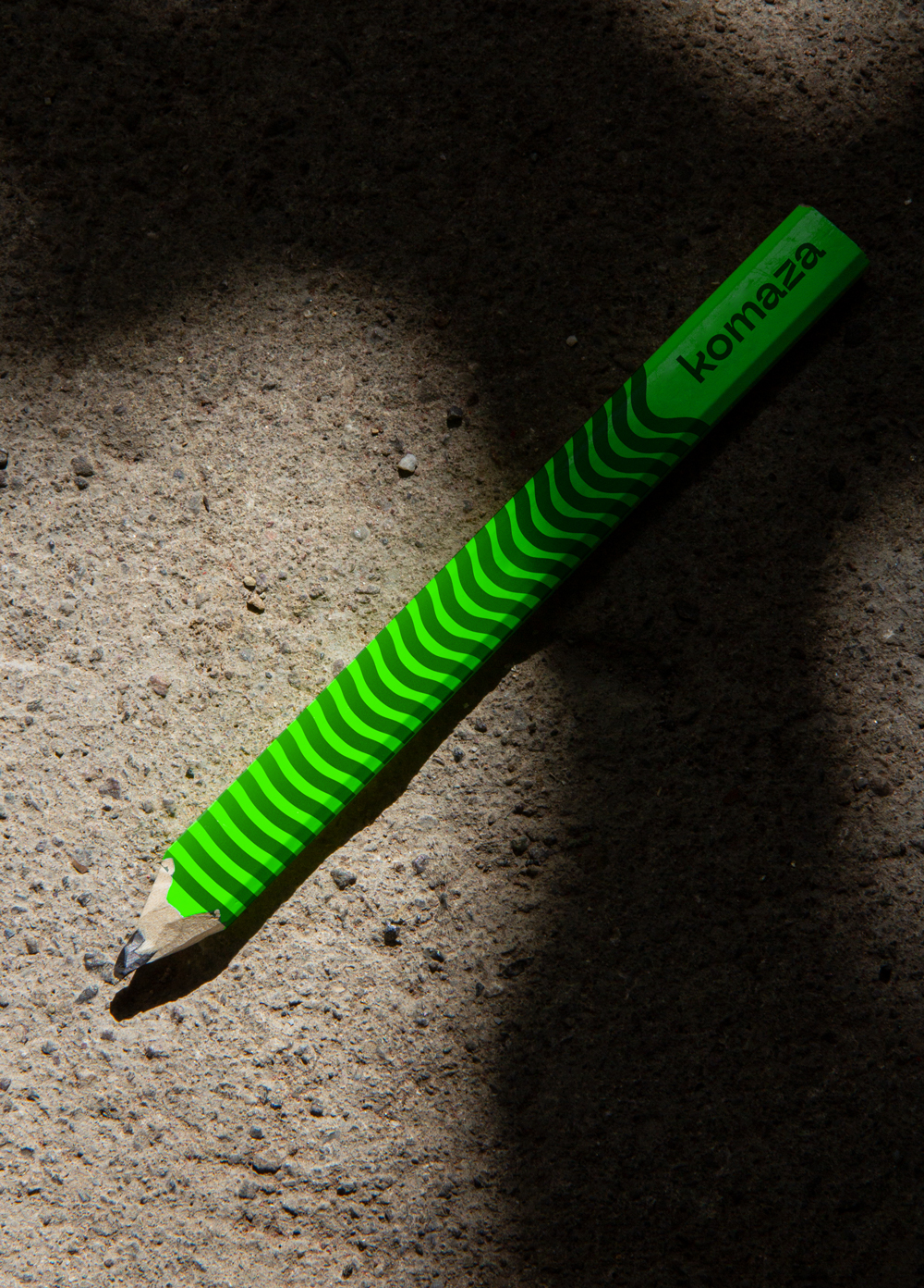
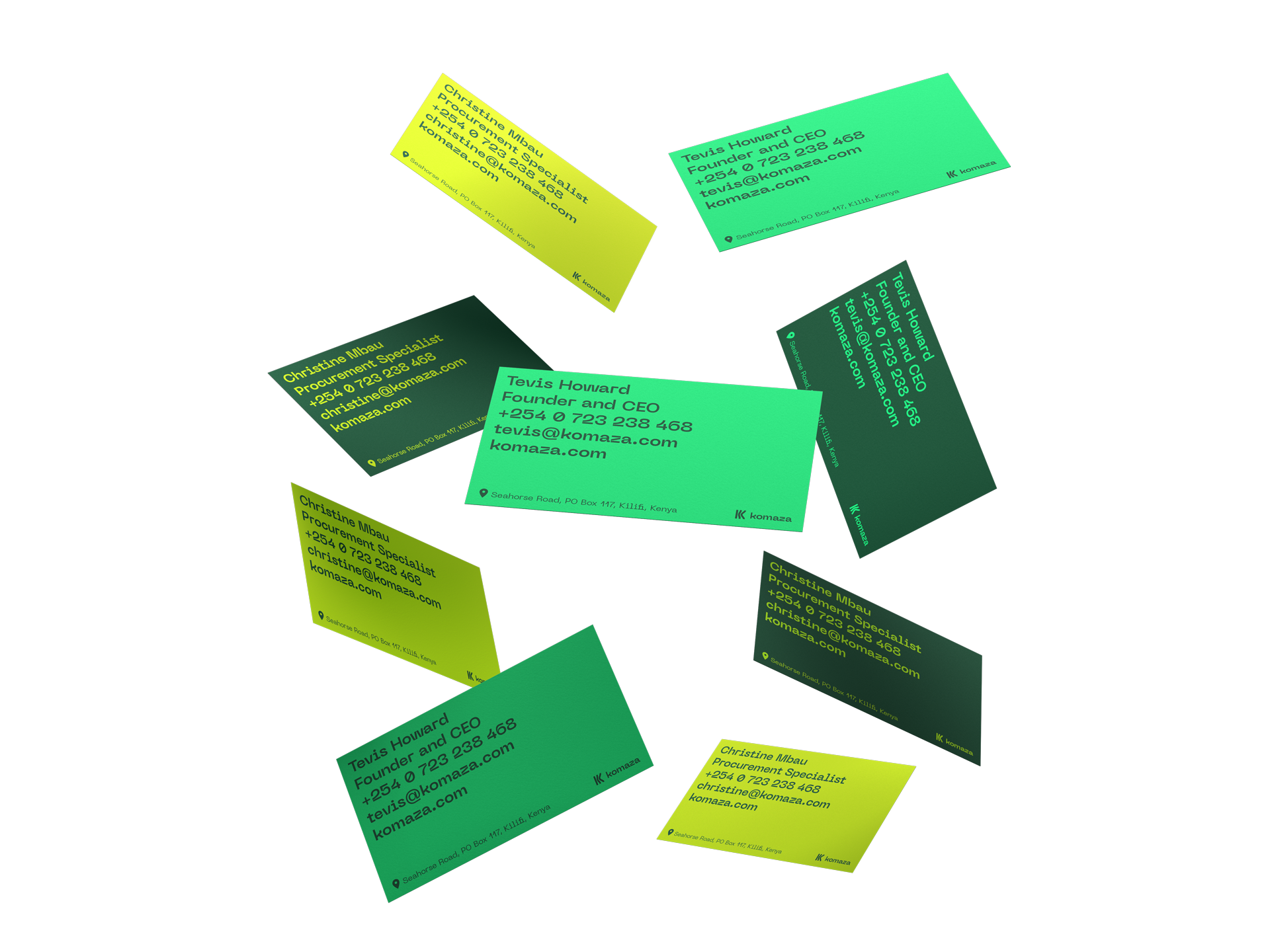
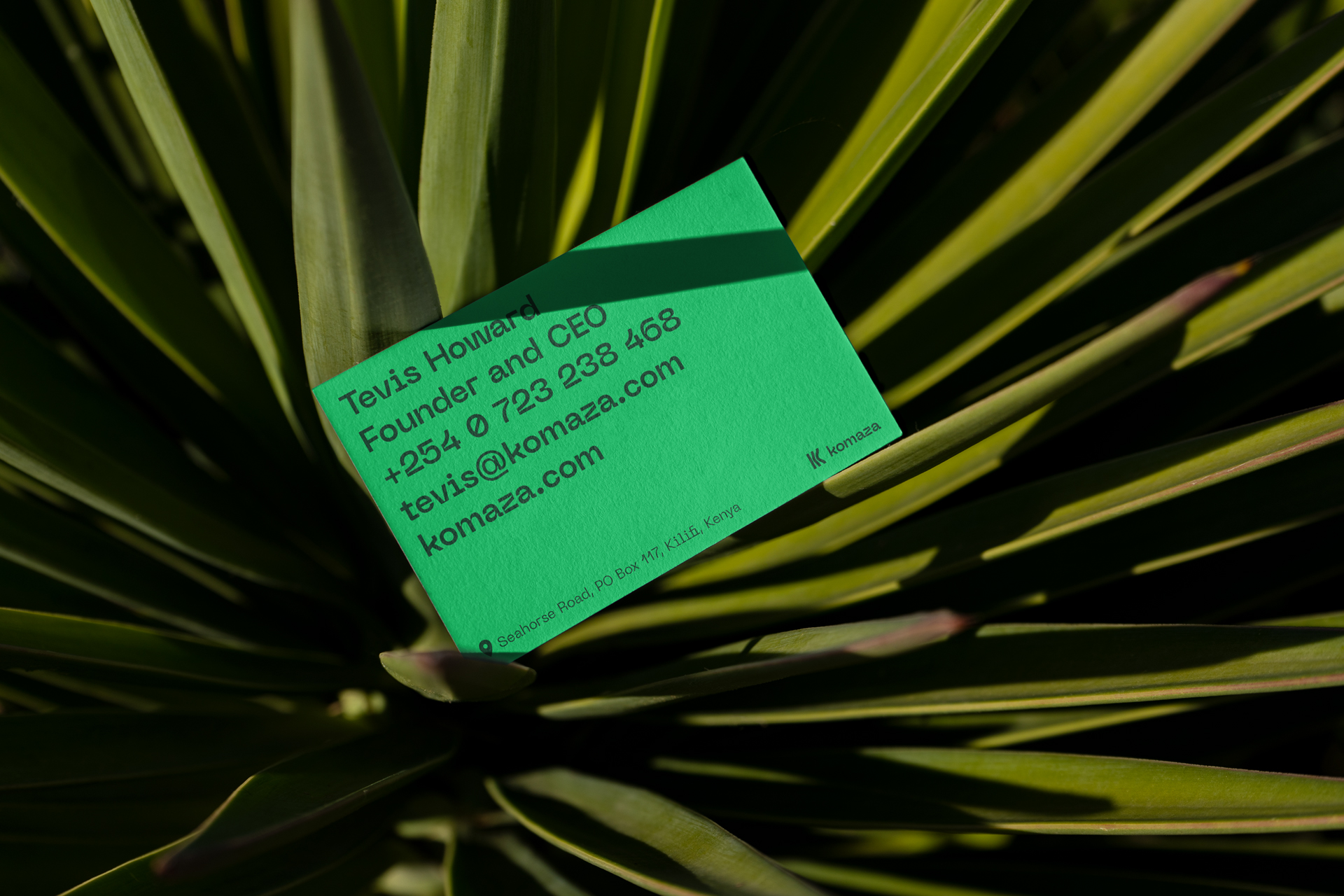
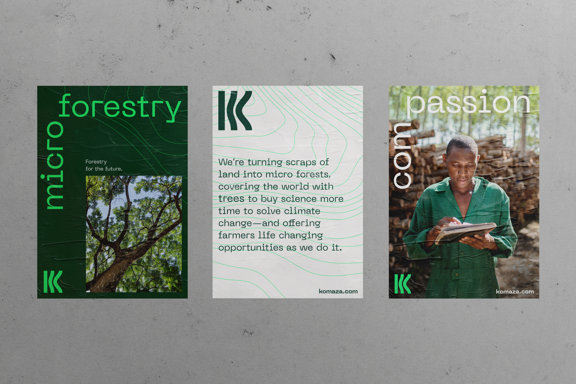
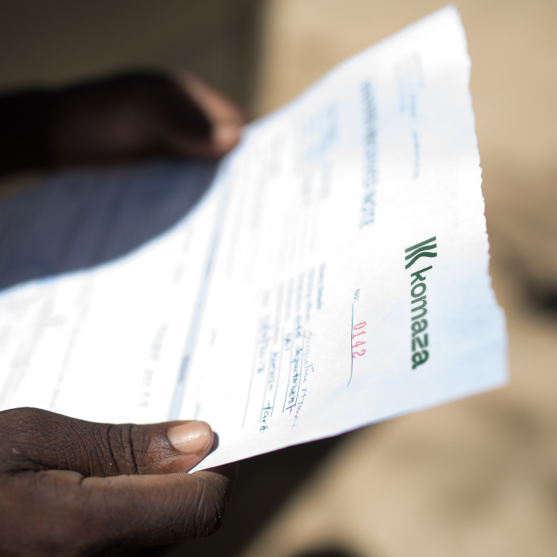
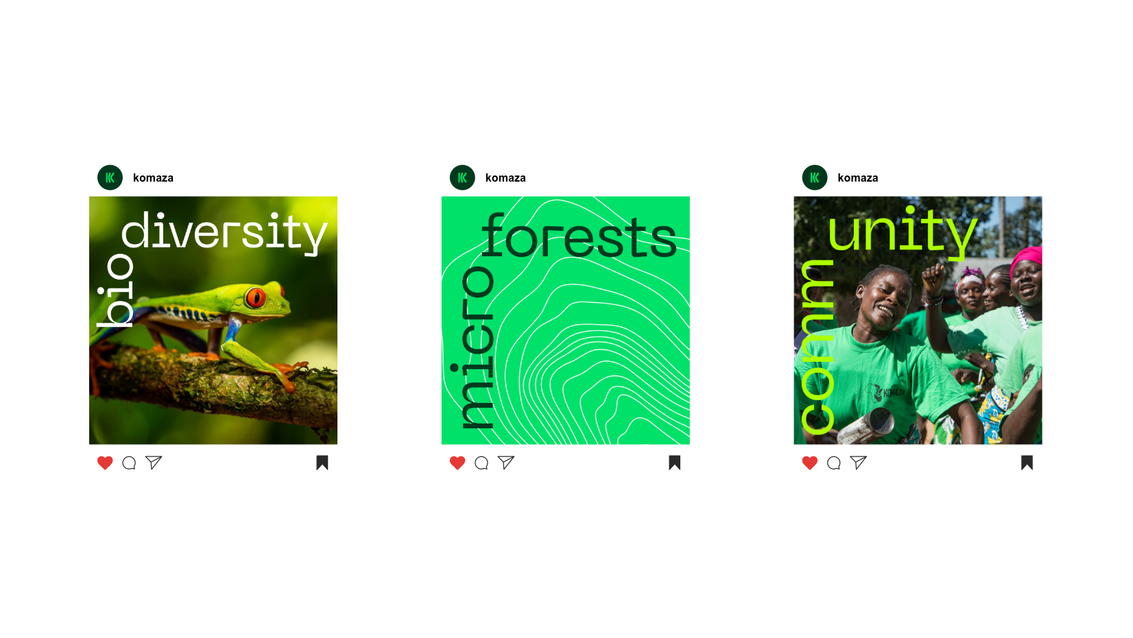
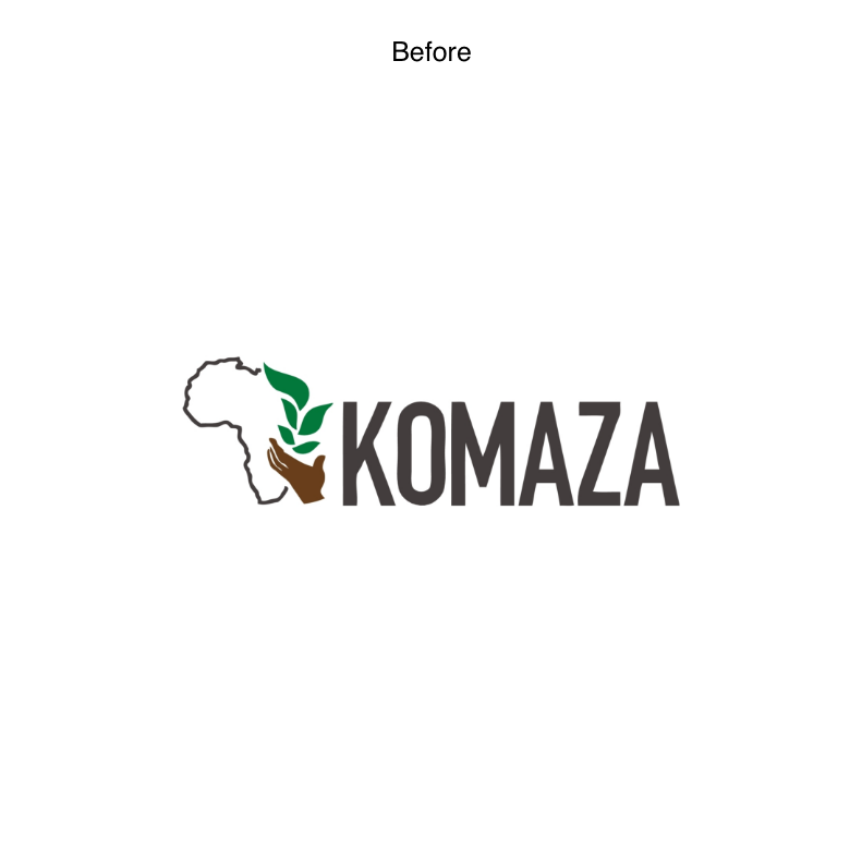
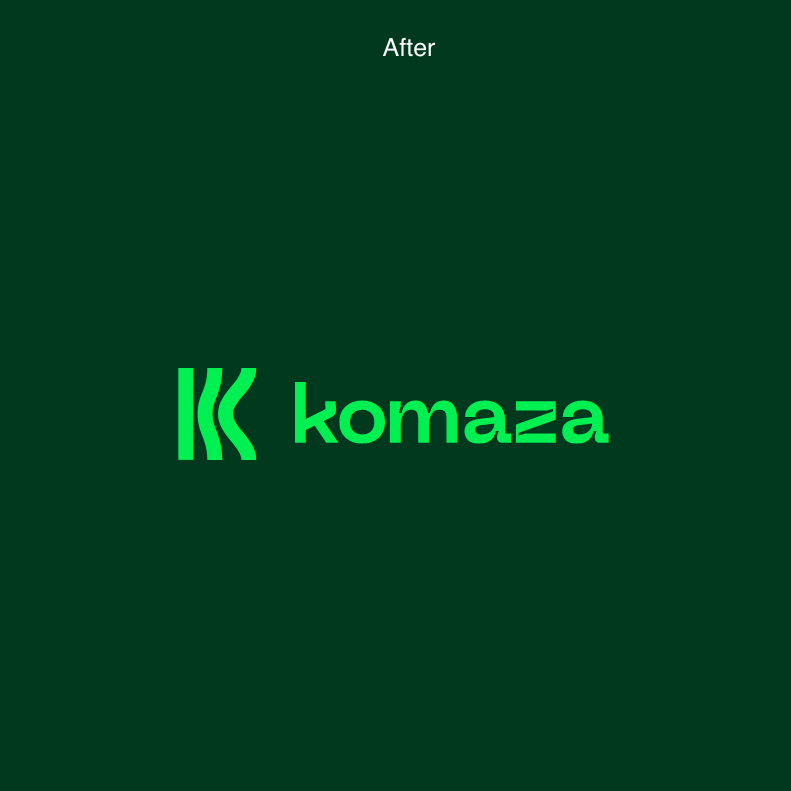
Having recently secured $28 million in their Series B financing, they needed an identity that reflects their growing venture. This new concepted symbol—formed by three lines that bend into the letter K—suggests wood grains, topography, and the ripple effects of our actions. Paired with a bold new type, the reimagined identity is confident, vibrant and unique.
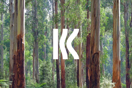

The symbol naturally extends itself into its own graphic element, either on its own or rippling across to create dynamic compositions and patterns.

